Every chart your team needs, on live data.
A full library of analyst-grade visuals — bars, lines, streams, gauges, maps and pivots — each one bound to your real, federated sources and refreshing in real time.
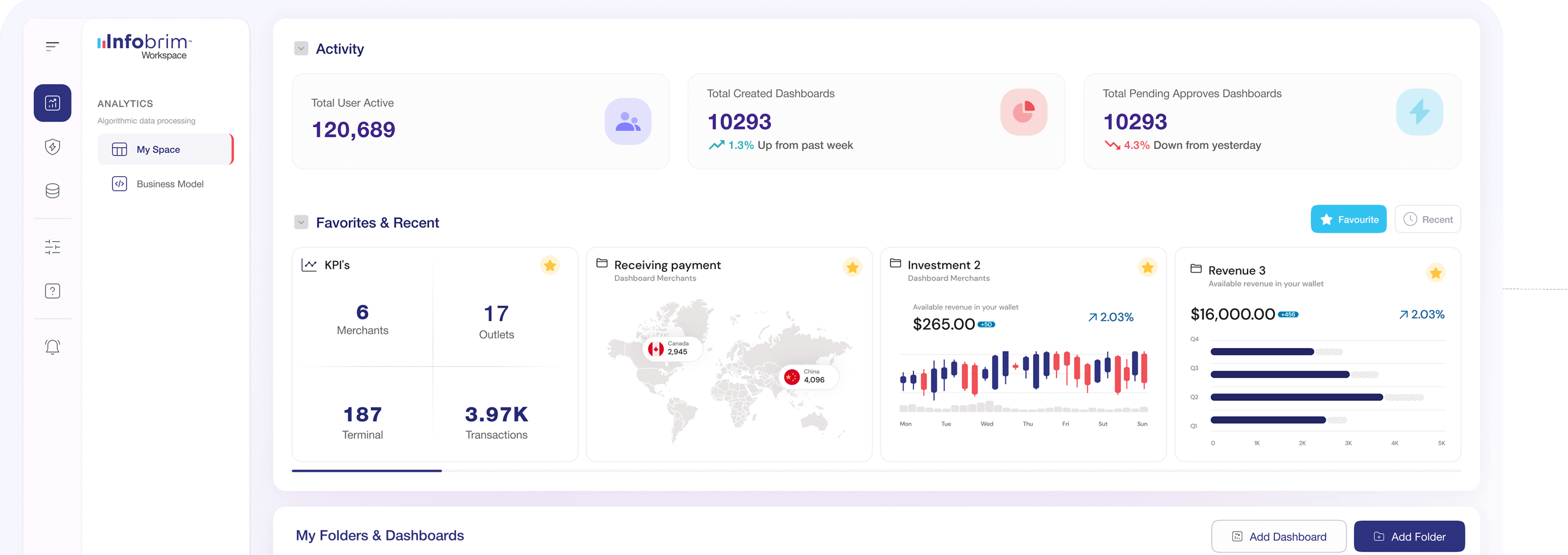
One canvas, every chart type.
Pick a visual and point it at a metric — Infobrim handles the query, the scale and the formatting. Mix any of them on a single board.
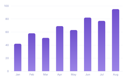
Bar & column
Compare categories side by side with instant sorting.
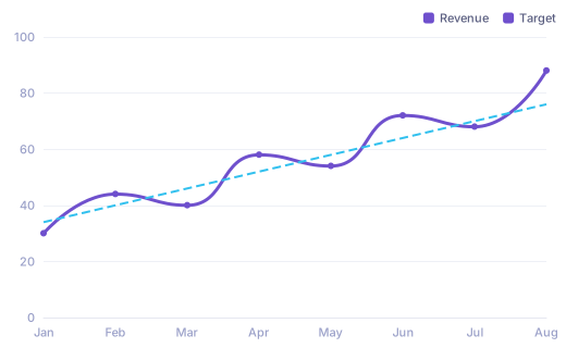
Line & trend
Track movement over time with multi-series overlays.
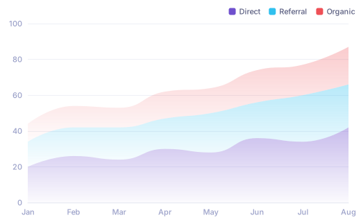
Area & stream
See composition shift across a continuous range.
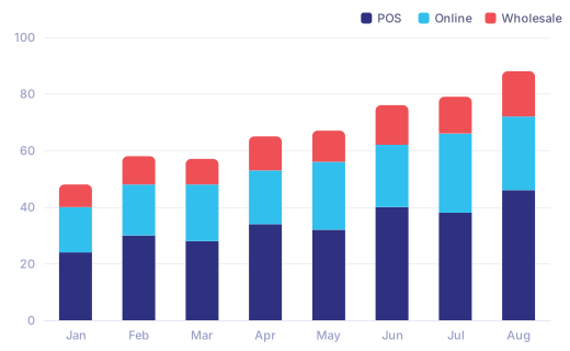
Stacked bar
Break every column into its contributing segments.
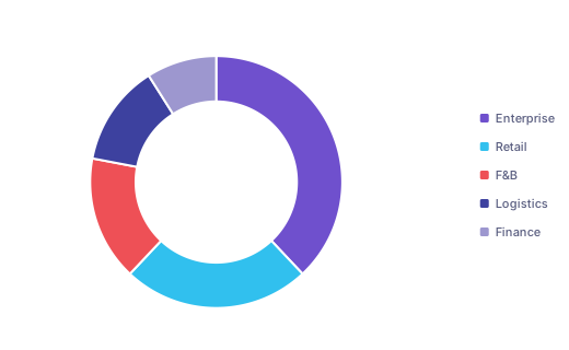
Donut & pie
Show a part-to-whole split at a single glance.
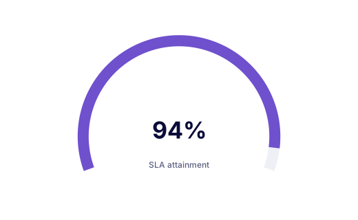
Gauge & KPI
Surface one number against its target instantly.
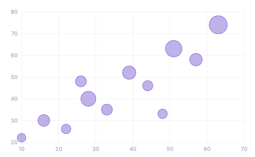
Scatter & bubble
Reveal correlation and outliers across two measures.
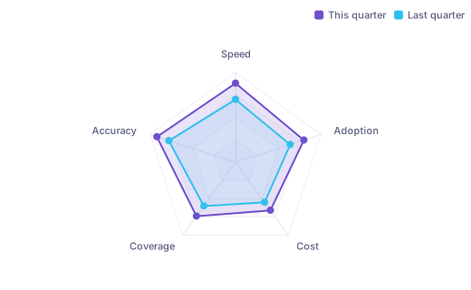
Radar
Compare many dimensions on one shape, period over period.
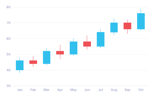
Candlestick
Read open, high, low and close on financial series.
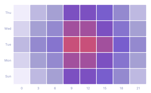
Heatmap
Spot density and patterns across two dimensions.
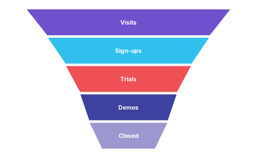
Funnel
Watch conversion drop off at every stage of a flow.
more chart types
The full visual library — mix any of them on one board.
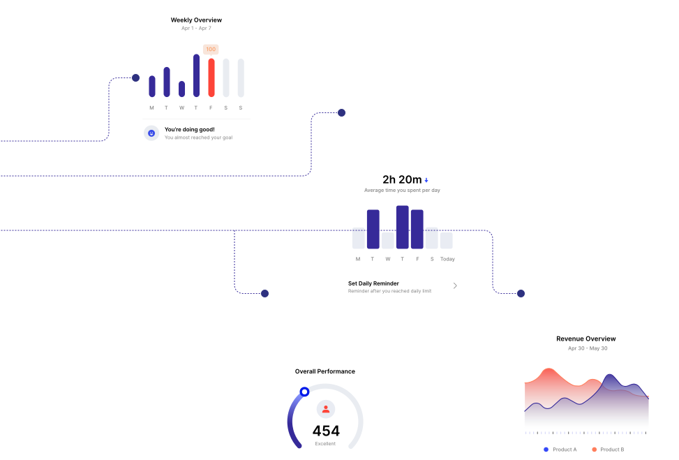
Every tile stays connected.
A dashboard is one live model, not a folder of exports. Filter once and every card responds together; click a bar and drill straight through to the rows behind it.
- Cross-filter the whole board from any single chart
- Drill from a summary down to source rows in two clicks
- Schedule any board as a recurring PDF or live link
Interactive filtering
Cross-visual highlighting and drill-down for genuine exploration, not static pictures.
Responsive by default
Boards adapt cleanly from boardroom display to phone, no rebuild required.
A rich library
Every major chart family, fully themeable to your brand and palette.
Every visual runs on the federation engine — governed by row- and column-level security.
See your data, drawn clearly.
Build a live board on your real, federated data — and share it with the people who need to decide.